Interior Design Color Schemes: How to Create a Cohesive Palette for Your Home
Key Takeaway
Interior design color schemes work best when built outward from fixed finishes like flooring, cabinetry, and stone, then organized using a dominant color, a supporting color, and one or two accents with compatible undertones. A whole-house palette of roughly six or seven hues, anchored by neutrals, creates cohesion without making every room identical. Always test physical samples under the room's real daylight and final artificial lighting before committing.
How do you choose an interior design color palette?
An effective interior design colour scheme starts with your home's fixed finishes, the way each room should feel, and the light in the space. From there, you choose one dominant colour family, one supporting colour, and one or two accents with compatible undertones, then test the complete colour palette under the room's real daylight and artificial lighting before committing. Your house is personal, and getting colour right carries real weight: it's one of the first things you notice and one of the costliest things to redo. This guide gives you a buildable plan, not just a gallery for inspiration.
What is an interior design color scheme?
Paint is only one layer. A colour scheme is the full set of colours and values you see when you walk into a room: flooring, cabinetry, stone, wood tones, metal finishes, furniture, textiles, artwork, and the light itself. Wall paint often gets all the attention because it's cheap to change, but the materials around it usually carry more visual weight. When you think about the whole picture instead of one wall, the final result holds together and the room's focal point reads clearly.
What are the main types of color schemes?

There's no single official count, but the colour wheel gives you six widely taught schemes. Each one describes how the main hues relate to one another, and each creates a different level of contrast and energy. A monochromatic scheme leans on one colour in many shades, while a complementary combination pairs opposites for punch.
| Scheme | How it works | Feeling it creates | Difficulty | Where it fits |
|---|---|---|---|---|
| Monochromatic | One hue varied by lightness, darkness, and saturation | Calm, pulled together | Easy | Bedrooms, offices |
| Analogous | Three or four neighboring hues on the wheel | Harmonious, relaxed | Easy to moderate | Living rooms, bedrooms |
| Complementary | Two hues directly opposite each other | Lively, high contrast | Moderate | Accent-driven spaces |
| Split-complementary | One main hue plus the two colors beside its complement | Balanced but interesting | Moderate | Family rooms, kitchens |
| Triadic | Three hues evenly spaced around the wheel | Vibrant, playful | Harder | Kids' rooms, creative spaces |
| Tetradic | Four hues forming two complementary pairs | Rich, complex | Hardest | Large, open spaces |
Start with the wood tones and materials staying in the home
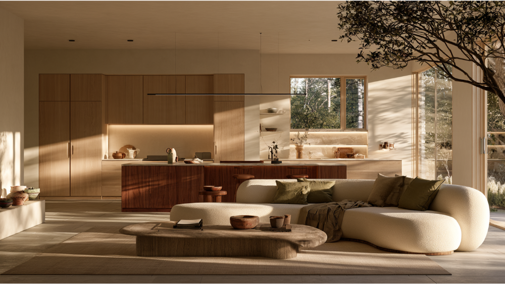
Build your palette outward from the things that are hard or expensive to replace. Flooring, cabinets, countertops, tile, fireplace materials, built-in woodwork, and large furniture all come with undertones you'll live with for years. A warm oak floor or a cool gray stone sets the direction for everything else and gives you a great base to work from. Read those undertones first, then choose paint and softer finishes that agree with them. If you pick a wall colour first, you can end up trying to force a stone slab or wood floor to coordinate with the one thing you could have changed in an afternoon. Colour works best when it's planned alongside your materials, not treated as a last-minute decision.
Decide how each room should feel and function
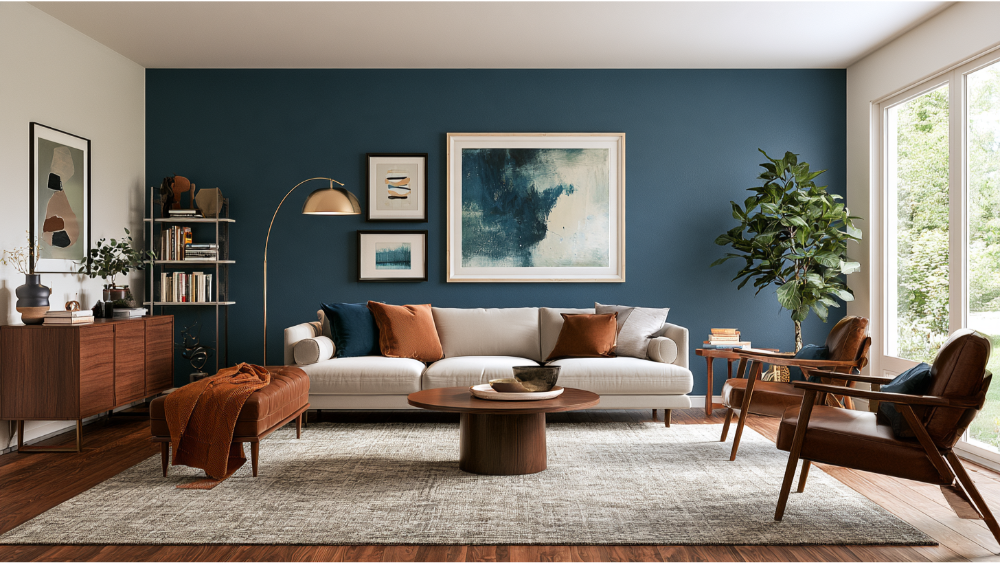
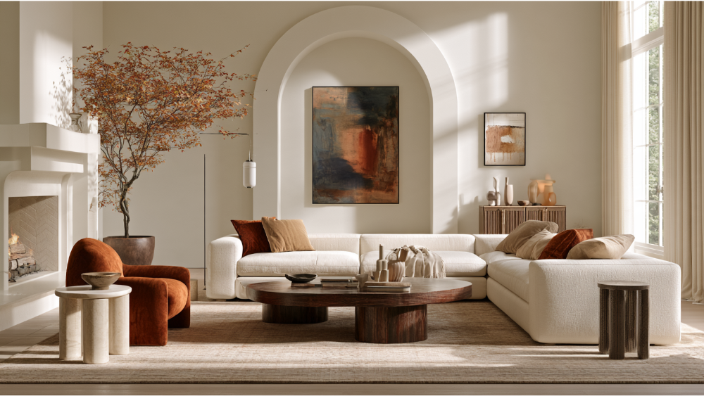
Mood is a design goal, so decide it before you pick hues. Warm hues like terracotta, soft peach, and brown are often associated with social, inviting rooms, which makes them a natural fit for living and dining spaces. These earthy tones borrow a sense of calm from nature. Cooler shades such as blue and green tend to read as restful and relaxing, so they work well in bedrooms and bathrooms. A 2025 systematic review of 132 studies covering 42,266 participants across 64 countries found real associations between colours and emotions, but the relationships are many-to-many. One colour can connect to several feelings, so no hue guarantees a specific reaction. Your history, the light, and the saturation all shape how a room actually feels to you.
How do you identify undertones, value, and saturation?
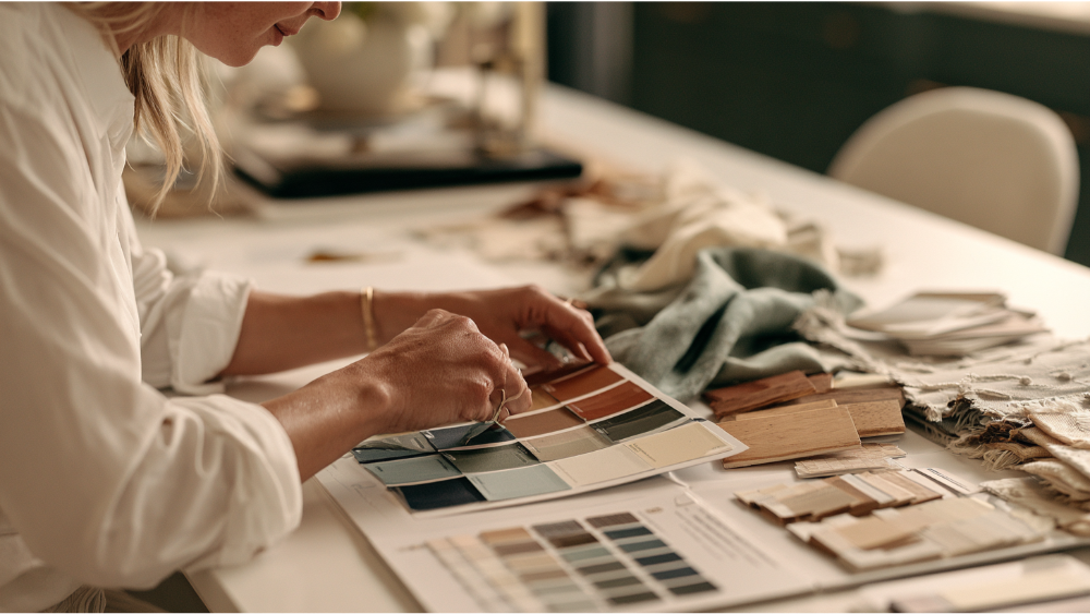
Three traits decide whether colours sit well together. Undertone is the subtle warmth or coolness hiding inside a colour. Value is how light or dark it is. Saturation is how muted or vivid it is. This is why two off white shades or two beiges can clash: one leans warm and yellow, the other cool and gray, and side by side the mismatch jumps out. Soft pastels like pale pink and gentle blue often coordinate easily because their undertones are quiet, and clean whites give a bright, airy backdrop that lets other colours breathe. The reliable test is simple: hold a physical sample right against your flooring and cabinetry, under the room's real light, and watch what the undertones do.
What is the 60-30-10 rule for color distribution?
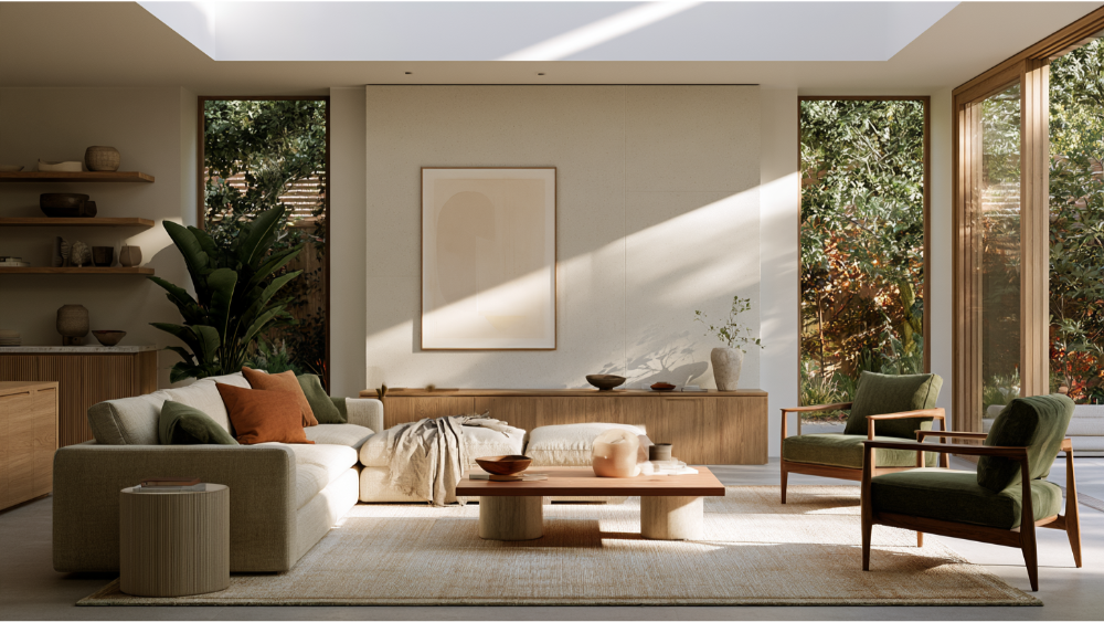
The 60-30-10 rule is a flexible way to think about visual weight, not a formula you calculate with square footage. It suggests:
- 60% dominant colour, usually walls and large furnishings, setting the overall tone
- 30% secondary colour, often upholstery, rugs, cabinetry, or drapery
- 10% accent, carried by art and accessories, where a bold touch of contrast adds interest
This doesn't limit a room to three literal colours. Wood grain, stone veining, metal finishes, texture, and pattern all live inside those three broad roles. Let your central, most-used room guide the dominant colour choice.
How do natural and artificial light change paint colors?
The same colour looks different as light shifts through the day and from room to room. East-facing rooms get warm morning light that cools by afternoon. North-facing rooms receive cool, indirect light that can push a soft gray toward blue. South-facing rooms stay flooded and warm. West-facing rooms turn golden in the evening and feel cooler at dawn. Two measurements help you plan. Light Reflectance Value runs on a 0 to 100 scale and tells you how much light a surface reflects, which is useful for brightening small or dark rooms, though it doesn't reveal undertone. Lamp colour temperature matters too: 2700 to 3000K gives a warm, yellow-toned light, while 4000K and higher reads cooler and bluer. Colour Rendering Index describes how true colours look under a source; ENERGY STAR certified downlights require a CRI of at least 80 with R9 above 0. Warm whites under warm lighting feel cozy. Always approve colours under the fixtures that will stay in the finished room.
How do you create color flow across the entire home?
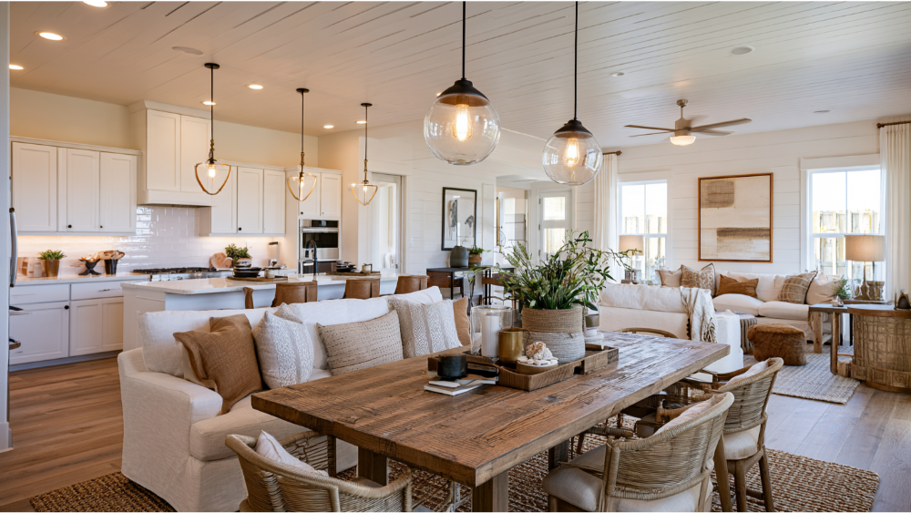
Cohesion across the entire house doesn't mean every room is identical. It means the eye recognizes a relationship as you move through the space. Repeat undertones from room to room, keep a consistent trim and ceiling strategy, and carry an accent colour between rooms in different proportions, so a pink pillow in one space becomes a larger feature in another. This kind of layering adds dimension without noise. Pay attention to doorway views and open-plan sightlines, and change colours at logical architectural breaks rather than mid-wall. A whole-house palette of roughly six or seven hues, built around a few neutrals, gives you a harmonious result with room to add personality.
Separate permanent color from changeable color
Sort your colour choices by how hard they are to undo. That way you can enjoy a trend without betting an entire remodel on it.
- Long-life: flooring, tile, stone, built-in cabinetry. Keep these versatile and lean on neutrals.
- Medium-life: wall paint, window treatments, major upholstery. Updatable, but not casually.
- Easy to change: pillows, art, small furniture, accessories. This is where bold or trendy colour belongs.
How to test a color scheme before you commit

Samples are where confidence gets built. Work through this before you sign off:
- Review physical samples, not just digital swatches
- Place them directly beside your fixed materials and walls
- Move them to several walls in the room
- Check them in morning, afternoon, and evening light
- Turn on the final lighting you'll actually use
- Compare connecting rooms together at the same time
- Check sheen and patterns, not only colour
- Use 3D rendering to compare broad directions, then let physical samples confirm the final choice
- Record the manufacturer, colour identifier, product, location, and sheen
Common color-scheme mistakes to avoid
- Choosing wall paint before fixed materials
- Mixing incompatible off white shades
- Ignoring how artificial lighting shifts colour
- Treating every room as unrelated to the next
- Using equal amounts of several strong colours instead of a clear dominant colour
- Following a trend or style that doesn't match your own taste
- Approving colour from a phone or computer screen alone
- Failing to document the final selections
2026 color trend direction (dated)
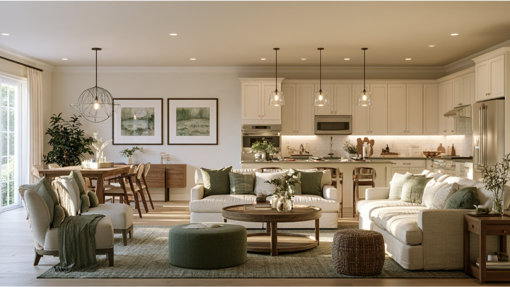
As of 2026, colour is moving toward warmth, saturated personality, and earthy shades like chocolate brown, terracotta, and green, along with colour drenching a whole room in one hue. A deep, rich tone like this can be a great choice when you want a sophisticated, enveloping mood. In a 2026 survey of 468 design professionals, 33% named chocolate brown a leading colour and 35% cited colour drenching as rising. That's a trade sample, not a verdict for every homeowner. A palette drawn from your own materials and light will outlast any single season's favorite style.
How an integrated design-build process keeps color decisions connected
Colour rarely goes wrong on its own. It goes wrong when drafting, interior design, lighting, material selection, and construction are decided by separate hands that never compare notes. With one team handling the full journey, your flooring, cabinetry, stone, and lighting are chosen to work with your paint instead of against it. A clever pairing of a soft neutral with one bold accent, for example, can offset a dark material and keep the whole room feeling inviting. 3D visualization lets you explore directions and see the beauty of a combination before anything is built, and you stay involved in the decisions that matter most. One safety note: homes built before 1978 can release lead dust when painted walls are disturbed, so the EPA's Renovation, Repair and Painting Rule generally requires paid firms doing covered work to be certified and to use lead-safe practices. Use interior-rated coatings and ventilate during painting and for a bit after, about two or three days.
Frequently asked questions
What are the main color schemes used in interior design?
The six most commonly taught are monochromatic, analogous, complementary, split-complementary, triadic, and tetradic. They describe how your main hues relate on the colour wheel, from one varied hue to a four-colour combination forming two complementary pairs.
What is the 60-30-10 color rule?
It's a flexible guide to visual weight: about 60% dominant colour, 30% secondary, and 10% accent. It's a starting point for proportion, not a rule that limits a room to three literal colours.
Should every room in my home have the same color scheme?
No. Rooms feel connected when they share undertones, a consistent trim and ceiling strategy, and repeated accents in different amounts. A whole-house palette of roughly six or seven hues, anchored by neutrals, keeps continuity without making everything identical.
How does lighting affect how paint colors look?
Natural light changes a colour throughout the day and by room orientation, and lamp colour temperature shifts it too, with 2700 to 3000K reading warm and 4000K or higher reading cool and blue. Always approve colours under the room's final lighting.
Should I choose paint before or after flooring and cabinets?
After. Flooring, cabinets, and countertops are expensive to replace, so build your palette around their undertones and wood tones, then let paint, which is easy to change, follow.
Bring your color vision to life
Your home deserves a palette you'll still love long after the samples come down. We would love to join you in your unique project and help you develop a personalized design direction before construction begins, so every colour choice is tested, coordinated, and right for you. Schedule your free consultation at (916) 701-9196 or (415) 480-4607, email us at [email protected], or reach out through our website contact form.